Before I was published, I would spend
hours daydreaming about the cover for PRETTY DARK NOTHING. My journal was full
of ideas and lists of other covers I liked. I’m very visual, and it was fun to
think about what readers would see when they picked my book up off the shelf
one day. Of course, I was under no illusion about seeing my ideas in the actual
design. I’d heard the horror stories from other authors about fights with their
publishers over covers only to be told that they would take what they were
given. Leave the design to the designers. Authors rarely get a choice in the matter, let
alone get asked an opinion, so I figured my thoughts would end up being nothing
more than a pipe dream.
So when I sold my book to Month9Books, I
was ready to give up control, cross my fingers, and hope for the best. But that
didn’t happen. My publisher actually wanted my opinion, even taking the time to
ask me what I envisioned the cover to look like. No promise that it would end
up being what I envisioned, but still. This doesn’t happen at every publishing
house.
So, when asked what I pictured my cover to look like, I pulled out my journal. Here’s
a peek at what I wished for.
1)
I
love dark and moody covers. Evocative covers. I hate when you can actually see
the face of the girl/person on the cover. This really annoys me. I want to be
able to imagine their face myself.
2)
I
picture the cover color scheme to be blues, dark purples, greys, black, white.
3)
Quinn
kneels with her head in her hands. She’s wearing her dark purple prom dress,
it’s torn and ragged. Her hair is wind-blown. She’s kneeling in front of water.
There are trees behind her. In the trees are dark shapes, shadows. They might
be reaching for her or maybe they could reach up and out to enclose the title
(similar to Torn). In the water you see her reflection, but instead of shadows,
you see the faint outline of angel wings. Or something along those lines.
I honestly don’t know how much or how
little of my request the designer took into consideration, if any, but here’s
the final cover. What do you think?
The cover of PRETTY DARK NOTHING was
designed by digital graphic artist and photographer Mette Breth Klausen. Mette
lives in Denmark and has done several covers for my publisher, Month9Books,
including fellow Darkly Delicious author, Dorothy Dryer. Check out Mette’s website
and Facebook page, her work is amazing! She brought
my cover to life and I couldn’t love it any more. She is truly a genius in my
eyes. To me, she captured the mood I wanted to convey perfectly. Although, I’m
told that one of the earlier versions Quinn was naked on the grave. My
publisher had to ask that clothing be put on her and I love what Mette did with
opaque, torn dress. It reminds me of shadows and cobwebs. So beautiful!
What are some of your favourite YA
covers? What draws your eye to a book on the shelf and makes you want to pick
it up?
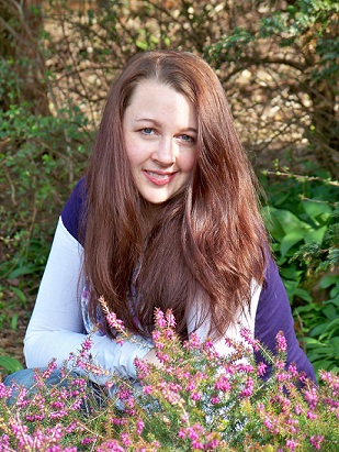
To learn more about Heather L. Reid and her books, click here.


Your cover is beautifully dark! I love it!
ReplyDeleteThanks, Rachel! I got to see possible cover art for book 2 yesterday. It is amazing!!! Can't wait for everyone to see it.
ReplyDeleteYour cover is stunning. There isn't one particular thing that draws me to a cover. Anything that is intriguing will get me to check out the back cover. =)
ReplyDeleteThat is an AWESOME cover!!
ReplyDeleteYour cover has always been on my list of all-time favorites. It's darkly delicious. See what I just did there. ;)
ReplyDelete