
I have to admit I fell in love with the
image (left) used for Embrace's original cover. I
thought the girl looking at something just out of view reflected the mystery of
what Madison Riley discovers in the book was perfect.

Then the most wonderful thing happened. Readers asked if
there’d be a sequel. They wanted more of Madison and her friends. My creative
wheels started turning and several months later Hold Tight was born. My publicist and I started to talk about
covers options, and together we decided to give Embrace a new look. I was geeked.
I got to see some of
the designs that were considered, and I was thrilled when I saw the final
cover. I really like this cover and love the change.

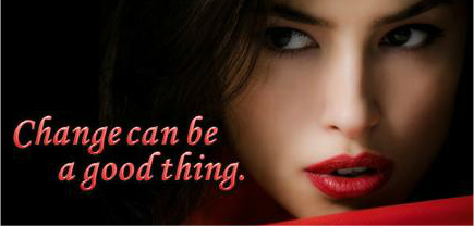
The cover for Hold
Tight came next. What was cool about this cover is I saw it while I was working
on edits. When I saw that the girl on the cover art had low lights I tweak one of the scenes to include a comment about her
new hair cut. The small changes included a comment that turned out to be a
perfect tie in to something that happens later in the book. It’s always great
when things work out like that.

I love all your covers - both the old and the revamped! Lucky you!
ReplyDeleteThanks =)
DeleteLOVE the covers! So exciting!
ReplyDeleteYour covers are all beautiful. I love that you revamped to make the books have similar cover features though. Very smart. :)
ReplyDelete