Admission: When it comes to covers, I’m completely
superficial—looks matter. This is because I know that while we are often and
repeatedly reminded to not, ‘judge a book by its cover’ the world absolutely
does just that.
Now I know, I know—you found that gem in that used bookstore
fifteen years ago. It has the most ridiculously bad cover you’ve ever seen, but
the WORDS, it’s the words in that book that matter because those words changed
your life!
Yeah, I bought that book too.
Once.
I still think it’s a great book and I’m happy I gave it a
chance despite its horrifically bad cover design—most people didn’t.
The point is, unless you already have brand name recognition
with legions of fans waiting, desperately, for you to drop that next book—many
people are not going to give your book a chance if the exterior bad.
This is because people, being human and needing this skill
to survive for hundreds of thousands of years, are wired to make associations.
Large animal=run
Small animal=try to catch and eat
Berry that killed Fred last week=don’t touch, probably kill
me this week
Bad cover=Bad book.
Even though we, very intellectualized modern humans know
these associations are not always true—we still make them every day,
consciously and unconsciously.
So all of this just to say, “I know that, when it comes to
publishing, how your book looks on the outside (and the inside too, but
interior layout is a whole other post) really does matter.”
I was super grateful that with ASCENDANT I got to have an
opinion. Quite frankly, as a writer it would pretty torturous to have to stand
next to all that hard work and love, trying to pimp it and sell it to a busy,
busy world, if it had ended up dressed in a cheap crappy outfit.
See, totally superficial.
Anyway, that was one of the nice things about working with a
small press, they asked me up front what did I like, what did I want, what did
I hate—while never making any specific promises about what the end result may
or may not end up like.
I sent them a whole list of things along with examples of a
couple of book covers I really loved and admired.
All of this was absolutely wonderful—believe me, author’s
don’t always get that much input up front. But the single thing that I think
made the biggest impact on the final design of my cover was the stock photo I
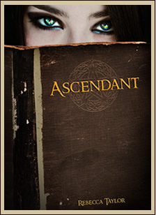
sent to the publisher along with the note that said: I’d really, really like a picture of someone's eyes peeking over a book.
And this is how they ran with it:
Honestly, I couldn’t be happier.
For more information about Rebecca Taylor and her books, visit her website HERE!


I am more likely to pick up a book when I like the cover. It's superficial, yes, but it's the first impression of the book. Ascendant does have a great cover. =)
ReplyDeleteI like this cover and I'm glad you had input!
ReplyDeleteAn RWA chapter recently advertised their judge a book by its cover contest (not sure if that was the name) which was open to anyone to go to the site and rate the submitted book covers. They ranged from clearly professional, to pretty good and I wasn't sure whether pro or not, to really really bad. There were a few I just cringed at, and I hurt for the author who truly thought theirs was good enough to enter in a cover contest. One was so bad I was sure it had to be a prank. I hate that some writers are spending so much time on their books and either choose or end up with terrible covers.
I think there are so many factors that go into what book ends up with what cover. Homemade ones can be really bad, but I have certainly seen plenty of big name publishers with terrible book covers as well. And while I had input...I certainly could not have designed a good cover myself! But, I know what I like--hopefully my taste doesn't suck!
DeleteBook covers matter! And this is a great one!
ReplyDelete